
There may be no single object that knows the worldwide ubiquity that the humble graphic t-shirt does. They come in as many shapes, sizes, and colors as one can imagine and say as much about their owner as their owner can say for themselves. They share with the world the places we’ve been, the things we appreciate, the stances we take, and much more. And they’re fun to design.
For designers and illustrators, t-shirts are usually a pleasure to create. I’ve been a graphic designer for more than 15 years, have designed a ton of t-shirts, and still enjoy it when one comes across my desk. To the owner, they can be deeply meaningful, capable of evoking a powerful emotional response. To the viewer, they are ephemeral, a fleeting glimpse into the life of another person. They have to do both things.
This spring you can take a turn designing your own graphic t-shirt for EMS! Read up on all the details here and get to it!
In the meantime, here are some general graphic design tenets—with examples from the EMS library—to get you started.

Visual Metaphor
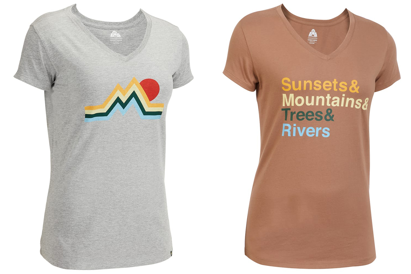
Visual metaphor is a simple and effective way to tell a story graphically. Consider how the representation of individual objects, colors, or words can convey a message, invoke a feeling, or even conjure an emotional response. Consider further how the juxtaposition of two or more objects, colors, or words can change that meaning—how it can add to it or subtract from it. Even the most benign graphic or symbol can be used to tell a powerful story—use them choicefully.
Keep it Simple
Resist the urge to throw the kitchen sink at this—effective visual communication is invariably clear and each element within must be carefully considered. Limit the number of fonts and colors in your work to only those that are critical to the story you’re trying to tell—and be brutal in dispatching those that aren’t. Less is always more.

Harmony versus Contrast
Good design can be hard to find in the gray areas so stick to one end of the spectrum or the other. Every element in a design is connected, and keeping those relationships simple will help in clearly conveying a message or a concept. Strive for order or embrace chaos. Make a mess or build a system. Seek harmony or seek contrast.
Consider the Form
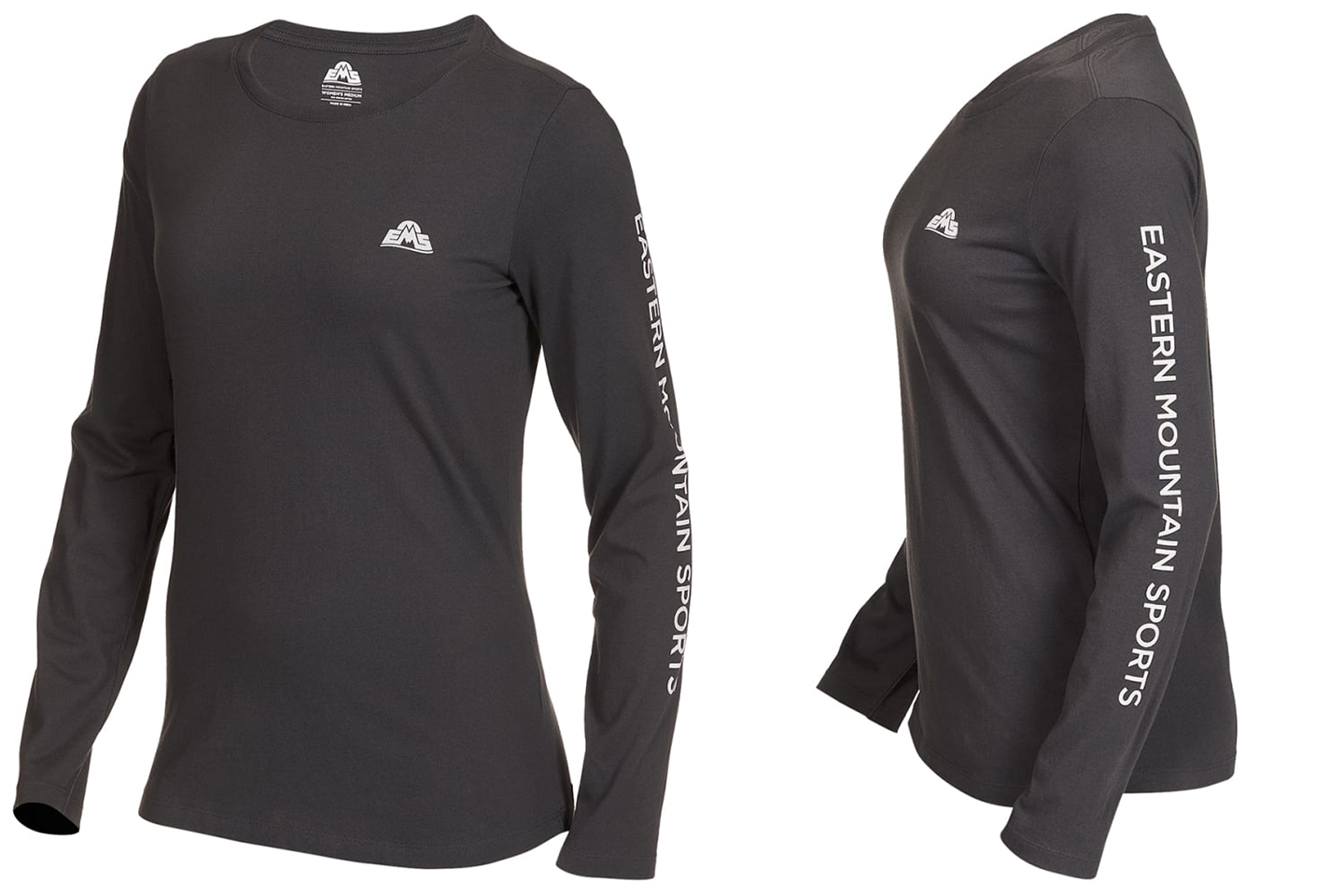
Specific design applications require specific considerations. Think about the form of a t-shirt, what its “printable areas” are, and where it can most effectively carry a design. Will yours stick to the front of the shirt or will it use the sleeves or the back? Will it wrap around? How will it look on a small or large size t-shirt? All of these should be front-of-mind when developing your design.

Check the Technique
Keep production in mind. Graphic t-shirts are more often than not screen printed, which is a very specific technique. Ink is pressed through a mesh screen onto an object—in this case a t-shirt—one color at a time. Artwork that has too many colors may be prohibitively expensive. Too fine a detail and the screen’s mesh may simply not be fine enough for the artwork to be reproduced. Production is just as important as design—lean into it.